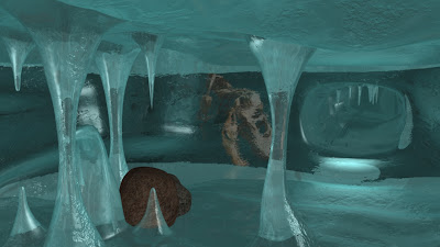
Friday, 10 June 2011
Ncloth to the pillow
for shot 1 in heroes we need to have some reaction with the pillow and the kids head. so i decided to use nCloth for this shot. it didnt go too well cos when i assigned it for the 1st time it went completly droopy and it collapsed on itself. so what i did was add the rigidity up a few units, 10.000 to be precise and the problem went. however. i need problem popped up, this was the fact that the hair geometry kept sticking to it. Also the the clothing seems to be interacting with the pillow even tho its not even touching it. here is an image of what i meant.
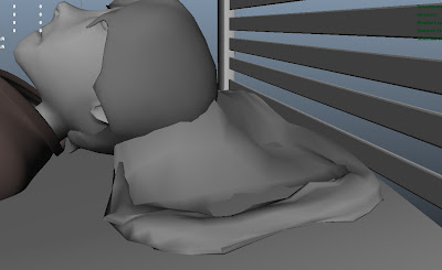
here are two videos demonstrating what i have to deal with.
as you can see the ncloth does give it bounce but it keeps sticking to the geometry. as you can also see i had to move the head out the way to stop it sticking.
this video shows a better view of the ncloth problem im having, you can see the twitches right at the end.
Tuesday, 7 June 2011
shot 20 final animation.
here is my final animation for shot 20.
happy with the results. this shot is a go go.
happy with the results. this shot is a go go.
shot 15 The Deep
Today i was given this shot to animate, the director was happy with my animation so he said that i should try another shots to speed up animation for the deep.
this was my second attempt at getting it right
there is a little to be done and i might improve it. but for now i will be my final attempt. need to make a start on other shots for Heroes1.0
this was my second attempt at getting it right
there is a little to be done and i might improve it. but for now i will be my final attempt. need to make a start on other shots for Heroes1.0
shot 20 Heroes 1.0 attempt 2
here is another attempt at shot 20. again, im not too sure with this shot, i think he still looks a little robotic.
animation clean up, adding blendshapes!
ive been asked to clean up some animation done in hereos1.0, ive had shots 35 and 38 this week and the 1st thing i noticed was the lack of life in the scene, i dont know if it was a good move but i created blend shapes, i made them for the curtains so i could make them move at least a little so they didnt look so dead.
i know so far the animation isnt great but we will work on these shots to make them better. right now its just important to get all the animation done. this is shot 35
this is shot 38
as you can see in both videos ive added blend shapes to the curtains, there is little movement but thats all i really wanted.
Monday, 6 June 2011
shot 20 Heroes 1.0
this is my first shot with the cape, im in mixed minds at the moment, this was my first test.
ive kinda worked backwards on this shot, i got the movement i wanted for the body and the worked on the rest.
here is shot 20 attempt 2
this is a lot smoother, especially when he gets up, it doesnt look like a robot anymore.
(i hope it doesnt anyway)
ive kinda worked backwards on this shot, i got the movement i wanted for the body and the worked on the rest.
here is shot 20 attempt 2
this is a lot smoother, especially when he gets up, it doesnt look like a robot anymore.
(i hope it doesnt anyway)
Sunday, 5 June 2011
The Deep shot 37 final attempts
here is my second try at making this smoother, im not sure if ive made it better or worse at this point.
this is my final attempt at this shot, i was happy with the results, the directer also liked it so i stopped playing around with it.
this is my final attempt at this shot, i was happy with the results, the directer also liked it so i stopped playing around with it.
Aniamtion shot 03 Heroes
here is a finished shot 3, its not chanced much from before expect that the mouth doenst open as much, ive also cleaned it up a little using the graph editor.
Saturday, 4 June 2011
shot 8 heroes 1.0
here is a quick test of shot 8, i would like to upload the progress of some of my shots but i keep forgetting to playblast earlier samples. this animation only took me like 2 hours to do.
here is the completed version of shot 8
i dont know whether i can see much difference in the two animations but i know the second video is after i cleaned up the graph editor.
here is the completed version of shot 8
i dont know whether i can see much difference in the two animations but i know the second video is after i cleaned up the graph editor.
Aniamtion shot 03 Heroes
as shot 3 is basically shot 2 but from a different angle i have added a few more frames, 48 to be precise. all Ive done is just extend the animation a little. here is a play blast of what ive done so far.
it could do with a little improvements but i think its alright so far. maybe a little less gap in the mouth.
it could do with a little improvements but i think its alright so far. maybe a little less gap in the mouth.
Final shot 34 for The Deep
final shot 34. i think ive done a good job for my first swim cycle animation
here is the shot before my final one. as you can see there is a few improvements to be made.
here is my final shot
here is the shot before my final one. as you can see there is a few improvements to be made.
here is my final shot
Friday, 3 June 2011
Shot 34 The Deep Atempt No.1
Attempt one, its obvious what i need to do here. flippers and arms movements would be the next step.
Accepted shot 10. well done carlos!
here is the shot 10 which was accepted in the scene, the first video shows the reaction with ncloth, we have to render -80 frames to allow the ncloth to settle before it can interact properly.
here is the video
here is the final shot starting from frame 0
i think it might need a little more time for the film to add a litte more tension to the shot.
here is the video
here is the final shot starting from frame 0
i think it might need a little more time for the film to add a litte more tension to the shot.
Thursday, 2 June 2011
animation for shot 10 heroes 1,0 FAIL!
animation for shot 10 went smoothly. but then i was told i got it wrong, he only opens the curtains with one hand, and its only a peek. not a full of exposure like i have animated. here is the scene that was not accepted do to my confusion
even though this shot is not going to be used im very happy with the way it has worked with the ncloth!
even though this shot is not going to be used im very happy with the way it has worked with the ncloth!
Bedsheet
So the nCloth is done, but what will we show when the kid is out of the bed? this is what i did to fix this little problem. I started with the original bedsheet and played it to let it rest on the mattress, i then duplicated it and deleted the history, which will also delete the nCloth. i then went into the move settings and ticked on smooth select. i made sure the fallout radios was high so it was easier to maintain a smooth geometry. i messed around with a it a little making sure to add creases in the duvet so it looks likes its been messed with. this is what i got
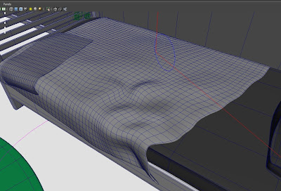
I'm happy with the result, it looks much better from the angle captured from the camera in the film. especially with the texture as the texture adds more of a crease look to it.

I'm happy with the result, it looks much better from the angle captured from the camera in the film. especially with the texture as the texture adds more of a crease look to it.
Aniamtion shot 02 Heroes
Animation has began, and ive been given a fair amount of shots to animate, ive also started animation for The deep but its not quite finished, ive only been given 4 shots so it shouldnt be too long before i get them done and dusted.
here is my attempt for shot 2.
this is a test of the ncloth for the 1st time with the animation in place. as you can see its worked!! im very happy that ive managed to pull it off. there is some improvements with the cloth but we need to move on for now.
here is a better shot with no curves. it is a little cleaner but looking at it now i cant really remember what the problem was. were happy to say that this shot is done! timing can be fixed later if its a problem.
Wednesday, 1 June 2011
Thursday, 19 May 2011
the animation for heroes is almost done, but there are a few things which still need to be added, earlier on in the year i was experimenting with ncloth with curtains, but they i decided not to have them working throughout the whole film as it would slow rendering down LOADS!! so what i did was just keep the mesh and delete the curtains, i have imported it in this scene so rendering could start when everything was ready. ive also had to model tapes to cover the window, as seen in the anamatic.
here is what it looks like at the moment.
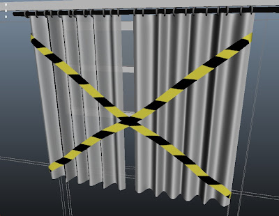
i would upload the UV map but its just a simple long rectangle and no UV mapping had to be done.
here is what it looks like at the moment.

i would upload the UV map but its just a simple long rectangle and no UV mapping had to be done.
Ocean Shader tests
I have had a go at this because Mariluz hasnt been able to get it right, no one has asked me to but i think its worth a try and see if can do any better. i havent tried doing sea shaders before but i know that they are pretty hard on your machine. this is what ive managed to render. as you can see its pretty simple, ive also learnt that this shader can not be animated, as it all changes at once and it looks really unrealistic.
to get this result, which i must admit isnt that good, ive applied the following attributes.
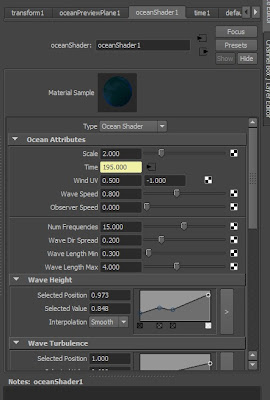
the most important atributes which i learnt about was probably the scale attribute and the Num Frequency as these affect the detail given out by the shader, its a good thing to play with when youre getting closes ups of the shader animating. a good number would be 45k, this will give you a very realistic movement, and when you turn the transparency up you get an amazing shot.
here is just a single shot of what i mean,
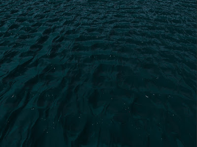
to get this result, which i must admit isnt that good, ive applied the following attributes.

the most important atributes which i learnt about was probably the scale attribute and the Num Frequency as these affect the detail given out by the shader, its a good thing to play with when youre getting closes ups of the shader animating. a good number would be 45k, this will give you a very realistic movement, and when you turn the transparency up you get an amazing shot.
here is just a single shot of what i mean,

Monday, 9 May 2011
Windmill for the The Deep
We have been asked by andy to model a few buildings for the exterior shot in The Deep, the shot where kid walks down to the sub. here is what i have worked from to make my windmill.
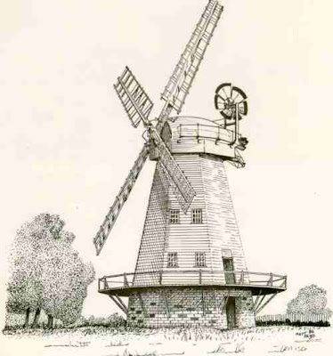
i know that my final design doesnt really come close to that but i think cos its going to be seen from far away it wont matter much. here is what i came up with.
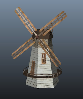
even tho its not much i think its a nice attempt.
here is what it looks like when Keith uploaded it to the scene
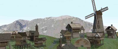

i know that my final design doesnt really come close to that but i think cos its going to be seen from far away it wont matter much. here is what i came up with.

even tho its not much i think its a nice attempt.
here is what it looks like when Keith uploaded it to the scene

Monday, 2 May 2011
Cape for heroes1.0
We encountered a problem when we were animating shot 19, the problem was the cape which the kid uses. in the animatic he uses the bedsheets to rap around his neck, and its a red sheet. but when i was texturing the bed i came up with this design using some of Andrew's art work. its far from what we had come up with in the earlier stages of the project but we all felt like it was a good improvement and that it added more character to the kids room. here is a pic
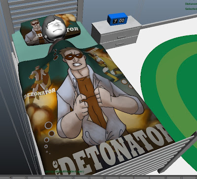
as you can see, this would look rather odd rapped around his neck like a cape, so i thought that we could solve this problem by simply adding something else to the bed, like a towel or a robe.
this is what i did to get things back on track before rendering could start.
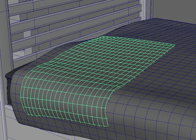
i made this by creating a polygon plane, adding nCloth to it, adding the already existing solves and nucleus, extruding the faces up a little to add thickness, and smoothing it out. i then played it in the timeline for it to start the animation, when i was happy with the position in duplicated it, and deleted the original mesh. this gave me a clean geometry and it wouldnt interact anymore. its only really for show anyway.
here is what it looks like on the bed
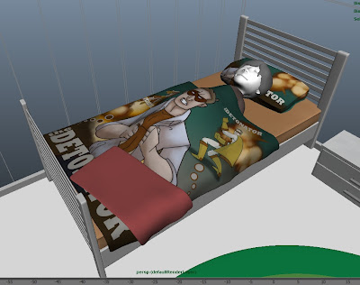

as you can see, this would look rather odd rapped around his neck like a cape, so i thought that we could solve this problem by simply adding something else to the bed, like a towel or a robe.
this is what i did to get things back on track before rendering could start.

i made this by creating a polygon plane, adding nCloth to it, adding the already existing solves and nucleus, extruding the faces up a little to add thickness, and smoothing it out. i then played it in the timeline for it to start the animation, when i was happy with the position in duplicated it, and deleted the original mesh. this gave me a clean geometry and it wouldnt interact anymore. its only really for show anyway.
here is what it looks like on the bed

Sunday, 1 May 2011
Texturing the power plant.
After finishing with the modelleling of the factory we needed to have it textured. i started to use shaders to add affects, but i couldn't get any good results, i didnt know whether it was down to the objects not being uv mapped but it just didnt work right.
i resulted in creating textures for the factory. i started by looking in CG textures.com for industrial buildings to get a feel of what i needed to get.
here is my first attempt to develop the texture for the main structure
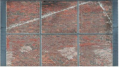
i plan to use this around the whole factory base.
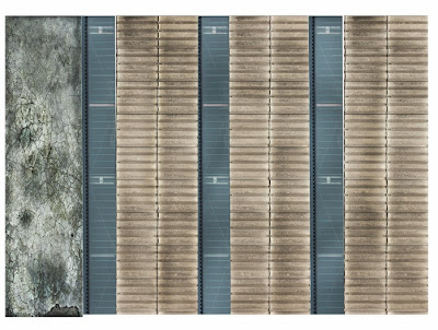
the next texture is of the top half of the building
this is made from a collection of textures i had already gathered.

im trying to keep it simple as the factory will be seen from afar. this is what it looks like on the bulding
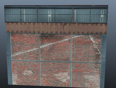
ive used the burn tool in photoshop to add patches making it a little darker in areas.
i used most of the textures from the first side to make the rest of the building. here is texture 2
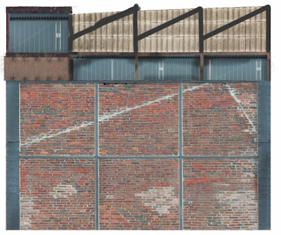
this is what the texture looks like on the building
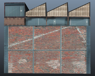
the roof was also very simple to do, once i add bump maps to these textures, the model will really come to life.
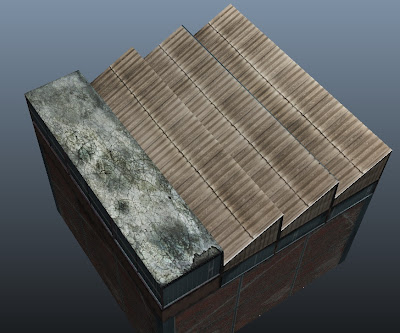
here is what the roof textures looks on the model
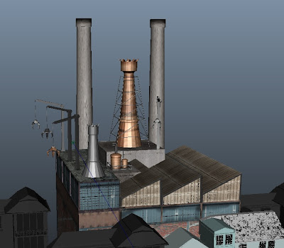
as you can see at this stage the building was really coming along well. i showed kofi and he was very happy with the look of the factory.
i have added a few shaders there but im not happy with them at all. they look too pixelated compared to the rest of the building. but as you can see, it looks pretty good so far.
i resulted in creating textures for the factory. i started by looking in CG textures.com for industrial buildings to get a feel of what i needed to get.
here is my first attempt to develop the texture for the main structure

i plan to use this around the whole factory base.
the next texture is of the top half of the building
this is made from a collection of textures i had already gathered.

im trying to keep it simple as the factory will be seen from afar. this is what it looks like on the bulding

ive used the burn tool in photoshop to add patches making it a little darker in areas.
i used most of the textures from the first side to make the rest of the building. here is texture 2

this is what the texture looks like on the building

the roof was also very simple to do, once i add bump maps to these textures, the model will really come to life.

here is what the roof textures looks on the model

as you can see at this stage the building was really coming along well. i showed kofi and he was very happy with the look of the factory.

i have added a few shaders there but im not happy with them at all. they look too pixelated compared to the rest of the building. but as you can see, it looks pretty good so far.
Saturday, 30 April 2011
Modelling the Factory
ive added the aditional structures that i wanted for the factory, i have made 3 types of chimneys, the big tall ones and smaller ones on the roof.
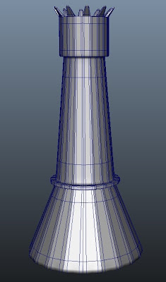
here is the biggest of them all, i will place this one behind the rest of the building

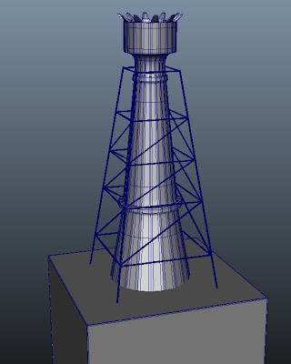
the image bellow is of the second chimney, i plan to make this a copper one, adding character to the factory, as kofi never said what the factory was for then i'll just add my own person style to it.
this is the third chimney i made for the building. its prestty much the same as the second one but a little smaller and without the supports.
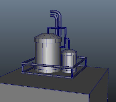
i also made a cooling tank to sit on the roof of the factory. its just a simple cylinder with smaller pipe like cylinders surrounding it.
the final thing i did was the crane, i plan to duplicated most of these things to make it look a little fuller. here is what it looks like so far
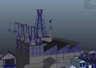
due to the ginormous scale in which kofi models i had to create each thing in a different scene and then import them in, once in i scaled them up to fit the current scene.
here is the biggest of them all, i will place this one behind the rest of the building

the image bellow is of the second chimney, i plan to make this a copper one, adding character to the factory, as kofi never said what the factory was for then i'll just add my own person style to it.

this is the third chimney i made for the building. its prestty much the same as the second one but a little smaller and without the supports.

i also made a cooling tank to sit on the roof of the factory. its just a simple cylinder with smaller pipe like cylinders surrounding it.

the final thing i did was the crane, i plan to duplicated most of these things to make it look a little fuller. here is what it looks like so far

due to the ginormous scale in which kofi models i had to create each thing in a different scene and then import them in, once in i scaled them up to fit the current scene.
gloves for heroes1.0
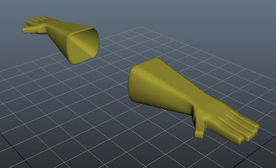
ive came up with a tricky assignment today i had to model the gloves for Heroes. what i did firts was try to add ncloth to a on the rig and animate the ginger to see what happened, this was a massive disaster and it slowed animation down incredibly and it didnt look realist at all. it also didn't keep its shape very well. so my next aproach was to duplicated the hand and scale it up so the hands would fit properly, this was another disappointment as between the fingers there was a lot of deformation. so i went back to the basics and started with a cube.
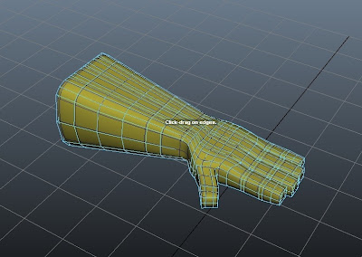
This is the finished model, ive duplicated it for both sides so its ready to add to the rig.
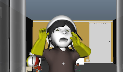
this is what it looks like on one of our animation shots, Clym has done very well merging the original hand with the gloves so it can be animated.

This is the finished model, ive duplicated it for both sides so its ready to add to the rig.

this is what it looks like on one of our animation shots, Clym has done very well merging the original hand with the gloves so it can be animated.

Friday, 29 April 2011
Modelling Factory
i have been giving the task to add additional parts to the power plant in heroes 1.0, i have to add more character to it. i will be adding big chimneys to give it a sense of power over the rest of the buildings in the scene. this is what kofi gave me to work with.
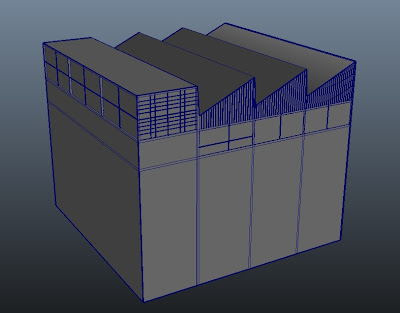
as you can see it has the industrial look to it, but no characteristics of it.
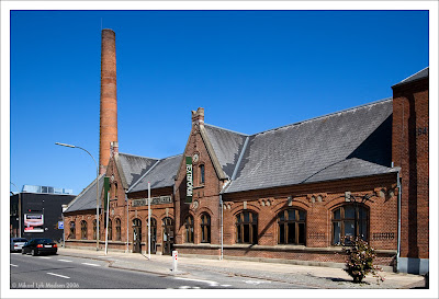
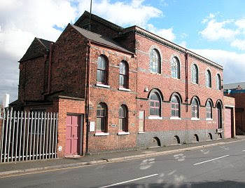
these two images above is more of what i have a mind, but i also want to add cranes so it adds that little extra. what i like about these images is the old worn look you get when looking at them,the feel of them nearing their last days as a structure.

as you can see it has the industrial look to it, but no characteristics of it.


these two images above is more of what i have a mind, but i also want to add cranes so it adds that little extra. what i like about these images is the old worn look you get when looking at them,the feel of them nearing their last days as a structure.
Tuesday, 19 April 2011
Ice experiment, goes well!
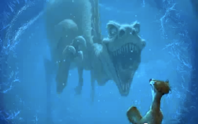
after finishing with cave, i was wondering whether i could maybe add something in the ice, like in ice age. here is a pic of what i mean
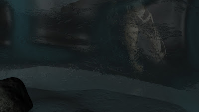
this is what i managed to do, its not as good but its a start.
i think with better lighting i could get a better result, its not a bad result i must admit, not quite as good but im new at playing around with shaders.
this is how i did it
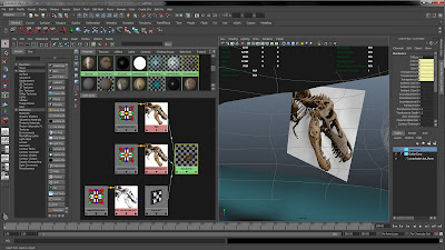
after i found the file i wanted of the internet i converted it to a PNG and deleted the white background on the file. then the created a PSD network to link the Bumpmap and the PNG file. as you can see in the final result of the network of shaders the banes are singled out and there is no white background.
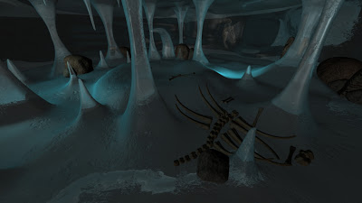
here is what the whole scene looks like, the lights are very simple and are only there to show my work.

this is what i managed to do, its not as good but its a start.
i think with better lighting i could get a better result, its not a bad result i must admit, not quite as good but im new at playing around with shaders.

this is how i did it

after i found the file i wanted of the internet i converted it to a PNG and deleted the white background on the file. then the created a PSD network to link the Bumpmap and the PNG file. as you can see in the final result of the network of shaders the banes are singled out and there is no white background.

here is what the whole scene looks like, the lights are very simple and are only there to show my work.
Wednesday, 13 April 2011
Saturday, 9 April 2011
bones and rocks for The Deep
Now that ive finished and added the ice shader to the ice cave i have decided to add a few things to the scene to add more character to it.
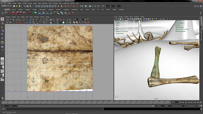
this is an image of a bone with i made out a polygon cube which i extruded a few times.
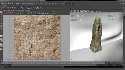
as you can see i have also UV mapped it and added a texture.
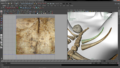
as you can see i have also duplicated this bone a few times to scatter more around the ice cave.
i have also made rocks from cubes and the sculpt polygon tools to reshape them.
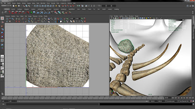
here is another rock which ive made for the scene
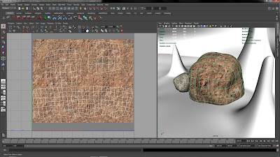
this is an image of a bone with i made out a polygon cube which i extruded a few times.
as you can see i have also UV mapped it and added a texture.

as you can see i have also duplicated this bone a few times to scatter more around the ice cave.

i have also made rocks from cubes and the sculpt polygon tools to reshape them.

here is another rock which ive made for the scene


Monday, 4 April 2011
Sunday, 3 April 2011
Ncloth problmes
I have been trying to do shot 19 in heroes1.0 where the kid uses the blanket as a cape, but every time I seem to take a step forward I then take three steps back, its really starting to slow the rest of my work down. the problem im having that that the cloth is not colliding with itself so it deforms through its own mesh. which is not going to look good in such a well prepared film. i don't want to let the team down due to this problem,
Friday, 1 April 2011
toy for heroes
today i have made a toy robot for room in heroes 1.0 it was loads of simple cubes with added shaders, nothing too extream as i was following this image as a reference. as you can see, it wouldnt take much to model this.

here is my version of the robot, i regret not doing the wine up handle for it you see on the right hand side.
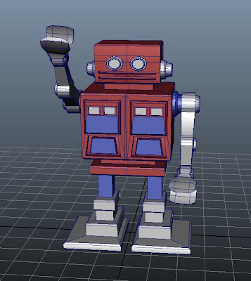
as you can see, my version is not as exciting but it will do, it is a simple toy anyway. im happy with the results. i might even try rigging it later on.

here is my version of the robot, i regret not doing the wine up handle for it you see on the right hand side.

as you can see, my version is not as exciting but it will do, it is a simple toy anyway. im happy with the results. i might even try rigging it later on.
Tuesday, 29 March 2011
final cave shaders
now that the cave is finished. i want to add the perfect shader so the environment will look as good as we imagined it in the storyboard.
here is what ive manged to do so far with a simple Phong, as you can see, its not very ice looking. more like glass. it just doesnt seem cold.
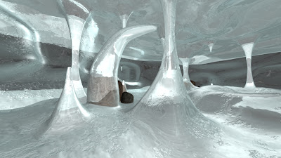
here is another attempt with the shader.
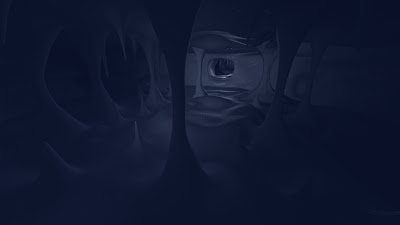
i have noticed that i keep getting stretch marks in the cave corridor and it looks really odd, i cant seem to be able to get rid of them, this is what i mean, it happens with all the shaders i apply, i think it might be my geometry doing this.
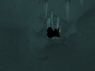
i will forget about the streach marks for now, i will upload the final cave when its finished.
here is what ive manged to do so far with a simple Phong, as you can see, its not very ice looking. more like glass. it just doesnt seem cold.

here is another attempt with the shader.

i have noticed that i keep getting stretch marks in the cave corridor and it looks really odd, i cant seem to be able to get rid of them, this is what i mean, it happens with all the shaders i apply, i think it might be my geometry doing this.

i will forget about the streach marks for now, i will upload the final cave when its finished.
Subscribe to:
Posts (Atom)


